
 Is there some sort of secret visual formula for successful albums, a design format that almost forces people to part with their moolah, encouraging buyers of all generations, all social demographics?
Can a terrible album have brilliant artwork? Can a brilliant album have terrible artwork (how about the Love And Money entry below? Ed…)?
So many questions, so little time. Someone somewhere must have researched which colours and designs have proved the most successful in terms of sales. But hell, it’s hard to believe that any of the below would have been cooked up in any kind of corporate brainstorming or focus-group session.
Here’s a motley selection of the 1980s’ most ill-advised album covers, in no particular order. Some are crushingly sexist, some boring, some ugly, some shocking, some just plain weird. And OK, a few are so bad they’re almost good…
18. Wishbone Ash: Raw To The Bone (1985)

17. Ratt: Out Of The Cellar (1984)

16. Poison: Open Up And Say…Ahh! (1984)

15. Eurythmics: Sweet Dreams (Are Made Of This) (1983)

14. Paul McCartney: McCartney II (1980)

13. Millie Jackson: Back To The S**t! (1985)

12. The Go-Betweens: 16 Lovers Lane (1988)

11. Ted Nugent: Scream Dream (1980)

10. Everything But The Girl: Eden (1984)

9. Loverboy: Get Lucky (1981)

8. OMD: Architecture & Morality (1981)

7. Snatch: If The Party’s In Your Mouth, We’re Comin’ (1985)

6. Jeff Beck: There And Back (1980)

5. Scorpions: Animal Magnetism (1980)

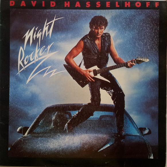
4. David Hasselhoff: Night Rocker (1985)
3. Love And Money: Strange Kind Of Love (1988)

2. The The: Infected (1985)

1. Dexys Midnight Runners: Don’t Stand Me Down (1985)

Can’t see your worst album cover of the ’80s? If so, pile in below…

Great list, but i will respectfully disagree on three of them. I actually love the Loverboy, Ratt and Poison one as I think those are brilliant. The Scorpions I like as well, but not as much. The rest are really crappy. Great idea for a post.
LikeLiked by 1 person
Fair enough, those three can definitely go in the ‘so crap they’re good’ file. I remember Beck choosing the Loverboy one as one of his favourites in an article for Vanity Fair a few years back.
LikeLiked by 1 person
I will give you that so bad their good. That Poison one is one that if knew nothing about the band, I would buy that strictly for the cover.
LikeLike
I would say that the Ratt and Scorpions ones are certainly ‘problematic’, borderline extremely demeaning, though not quite as bad as the original banned ‘Smell The Glove’ or ‘Appetite For Destruction’ covers… I take your point on the Poison one, it definitely stands out. It must have worked cos I think that album was a massive seller.
LikeLiked by 1 person
How did you cull it down to only 17??
LikeLiked by 1 person
True, there must be a load more… Give us some other contenders!
LikeLiked by 1 person
Sorry, but I can’t see past that Millie Jackson one – I had forgotten just how truly bad that LP cover was!
LikeLiked by 1 person
Haha, it’s a travesty isn’t it… But what guts to even consider doing it. Can’t believe she got away with it.
LikeLiked by 1 person
Ooh that’s harsh on Dexys….I’ve always quite liked it! The sleeve for its sole single, This Is What She’s Like, might have been a better cover for the album. Likewise, the Love & Money one is a surprise to see on this list…is it just too dull, or creepy?
LikeLiked by 1 person
Dexys look like a miserable bunch of accountants! I guess that’s kind of the point… The Love And Money inclusion is maybe a bit harsh but it just seems such a dunderheadedly literal reading of the album title. And a bit dull/unflattering. James Grant told me that it was based on a famous old photo. He also said they had months of meetings discussing the details of the shoot! Amazing the amount of money sloshing around the business at the end of the ’80s…
LikeLike
Protest! Call the Ref! Some of those are outstanding.
The Dexy’s is hilarious.
The Jeff Beck simple and clever (mimicking the stencils used on amps and other road gear).
OMD is brilliant – do you have the die-cut cover?
Eurythmics doesn’t quite work, but there is a lovely clean Georg Jensen aesthetic there I like.
Snatch is… a low point in Western civilisation.
I demand a recount!
LikeLiked by 2 people
Interesting. The Dexys one is kind of funny but it basically says: ‘Don’t buy this album’! I understand the thing about the Becko but would it have killed them to put the title on the cover?! The OMD/Eurythmics inclusions I knew would be a bit controversial but they have always looked a bit ‘GCSE design project’ to me…
LikeLiked by 1 person
A well-taken right of reply, sir!
LikeLiked by 1 person
That’s an interesting list – I agree with most, but I quite like that OMD one. I also think McCartney is handsome enough to pull off that dopey shot.
LikeLike
Yeah, the Macca one has an off-the-cuff factor that almost works. But only almost… It’s not even in focus though! I guess that’s kind of the point too…
LikeLiked by 2 people
Poison is one of my nicknames, and I take offence with that cover, and their music for that matter. LOL!
LikeLiked by 1 person
I’m with you on that…
LikeLiked by 1 person
As much as one’s love for everythig 80s, the roots go back in time to the late 60s and 70s. A favourite is Wishbone Ash with their iconic ‘Argus’ cover – shot in the south of France and featuring a helmut left over from Ken Russell’s ‘The Devils’ film. Then, later, we had the great cover for ‘There’s the Rub’ and even ‘New England’. But in 1985 they unleashed ‘Raw To The Bone’ with its absolue shocker of a cover.
LikeLiked by 1 person
Brilliant choice. It has slotted in perfectly at #18…
LikeLike
I disagree on the “The The” cover…however, this might be b/c I think that Matt Johnson ist one of the (if not THE) most under-estimated musicians ever, His lyrics still are spot-on today. And the songs still rock the house.
LikeLiked by 1 person
Interesting. I had a feeling that inclusion might ruffle a few feathers. He certainly has some very loyal fans. I’m yet to be convinced myself, though do like a few tracks on ‘Infected’.
LikeLike
It´s not about the album arts alone. When I heard “The The” for the first time, I was really shocked how damn great his music was. I think Matt Johnson really deserves a lot more attention. Songs like “Uncertain smile” with the great piano solo by Jools Holland (yes, THAT Jools Holland) or “Giant” with a minute-long percussion solo, which was a dancefloor smasher in the small clubs at that time just deserve more attention. And all of his albums are gems, just listen to them. “Mind Bomb” e.g. is a real masterpiece.
All in all I am happy and sad that M.J. never got that attention. His music is great, but OTOH it is nice to have him as “my personal discovery” that most people do not know about.
LikeLike
Funny thing about this is that i found your website while doing a search for articles about Love and Money. Read your interview with James Grant then poked around and found this article. Nobody can never say you aren’t honest. LOL.
I don’t know. I like the Millie Jackson cover. Kind of a bold approach for a mainstream R&B artist.
LikeLiked by 1 person
True – it’s certainly bold. No getting away from that.
LikeLike
Actually I think some of these covers are great: Eurythmics, OMD, Everything But The Girl, Love & Money, Dexys…
There was a geometrical / minimalist design trend in the 80’s which you seem to be completely ignorant about. You could have filled your list with Iron Maiden cover art (plus Millie Jackson!)
But don’t get me wrong: some of my favourite 80’s albums have awful covers IMHO: Dexys’ Too-Rye-Ay, Level 42’s The Pursuit of Accidents, Hue & Cry’s Seduced and Abandoned…
As for Dexys looking like “accountants”… again you’ve completely missed the point. This was Dexys’ Ivy League phase. They wore Brooks Brothers and updated the classic American style of prep schools and universities from the late 50’s and early 60’s. Again this just shows your lack of knowledge.
What a disappointing website. Despite being named after a brilliant song by one of my favourite groups ever I’m sad to see it’s filled with mediocrity.
LikeLiked by 1 person
Thanks ‘Alex’. Sounds like you need to start your own website about ’80s music.
LikeLike
“What a disappointing website. Despite being named after a brilliant song by one of my favourite groups ever I’m sad to see it’s filled with mediocrity.”
Alex, please give a link to your own pristine website…
LikeLike
There are far worse 80s sleeves than OMD’s A & M (designed by the great Peter Saville) or Eurythmics’ Sweet Dreams (designed by, er, Blancmange’s former drummer Laurence Stevens, but still fine).
LikeLike
There are, and some of them are listed on this page. Any other suggestions welcome.
LikeLike
Great, hilarious piece. One wonders why Jackson’s “people” wouldn’t veto such an idea before commercial release. Always loved the OMD cover and album itself, though.
Cheers!
LikeLiked by 1 person
Thanks for stopping by. I know, I guess Millie just demanded it! I could be wrong but I also vaguely remember that she released albums on her own label at the time.
LikeLike